SAGA INC. × SHOCHU X talks about the intention of rebranding
This time, we have invited Mr. Sagae, the creative director of SAGA INC., who accompanied us in the rebranding of SHOCHU I'll visit you.
Kota Sagae
SAGA INC. ( https://sagainc.co.jp/ )
Creative director/art director/designer
We provide design and direction in a wide range of categories, from fields related to daily life to art and culture, to cutting-edge science, in order to provide designs that increase the value of your brand, expand your circle of sympathy, and lead to a sense of happiness in your target audience. It has been. He has won numerous awards, including Japan's Good Design Award and Pentaward, a global packaging design award, and has been praised for his work that encompasses everything from insight and purpose-based concept work to art direction and design.
[Examples of works]
・Rebranding of craft beer “Ginga Kogen Beer” ・Package design for craft gin “Kanomori” ・Package design for “Kirin no Soft Tennensui” ・Package design for “Jiichiro” (rusks, brownies, etc.) etc.
The bond between Mr. Sagae and Mr. Hashimoto is connected by bottle design and passion.
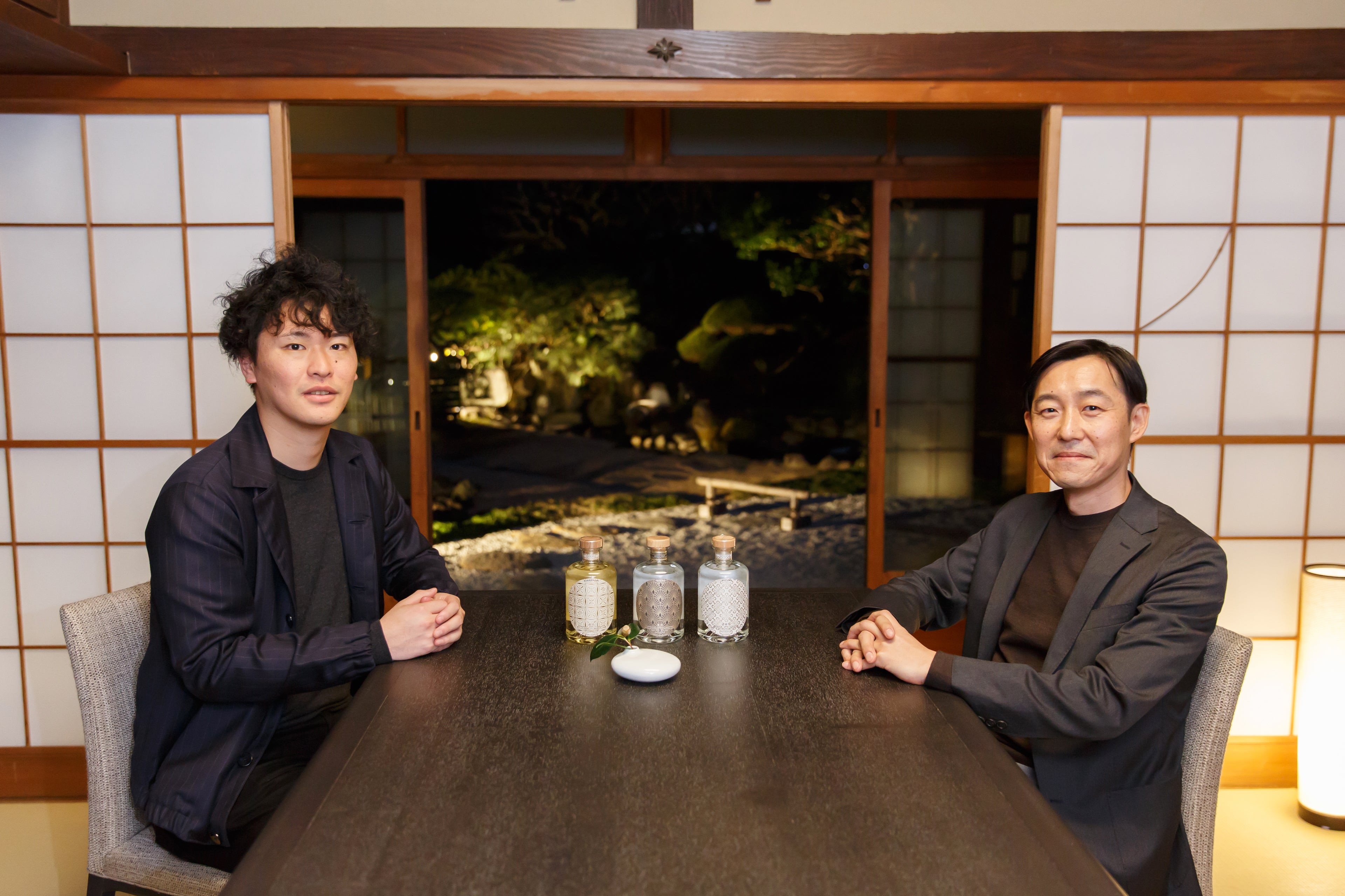
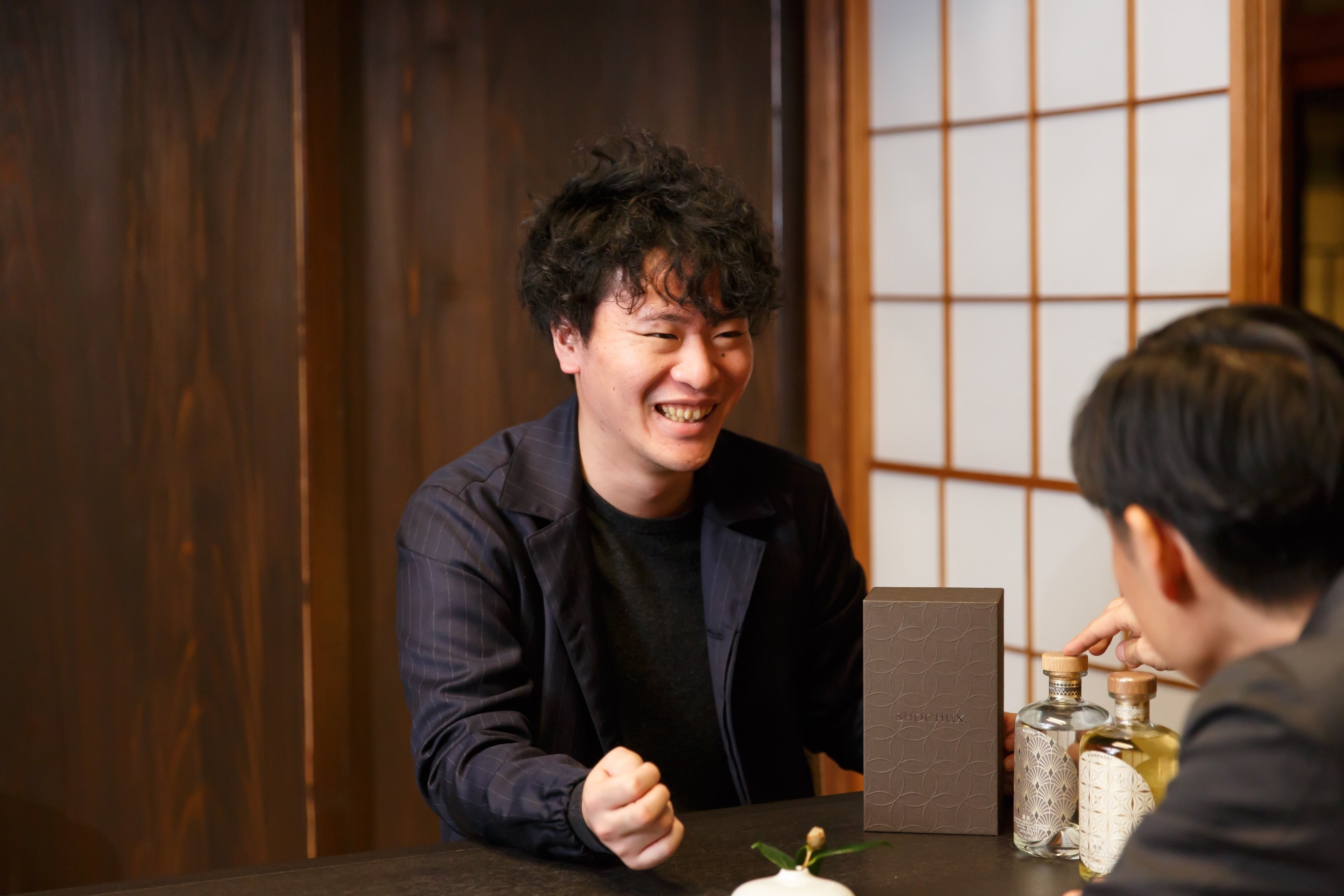
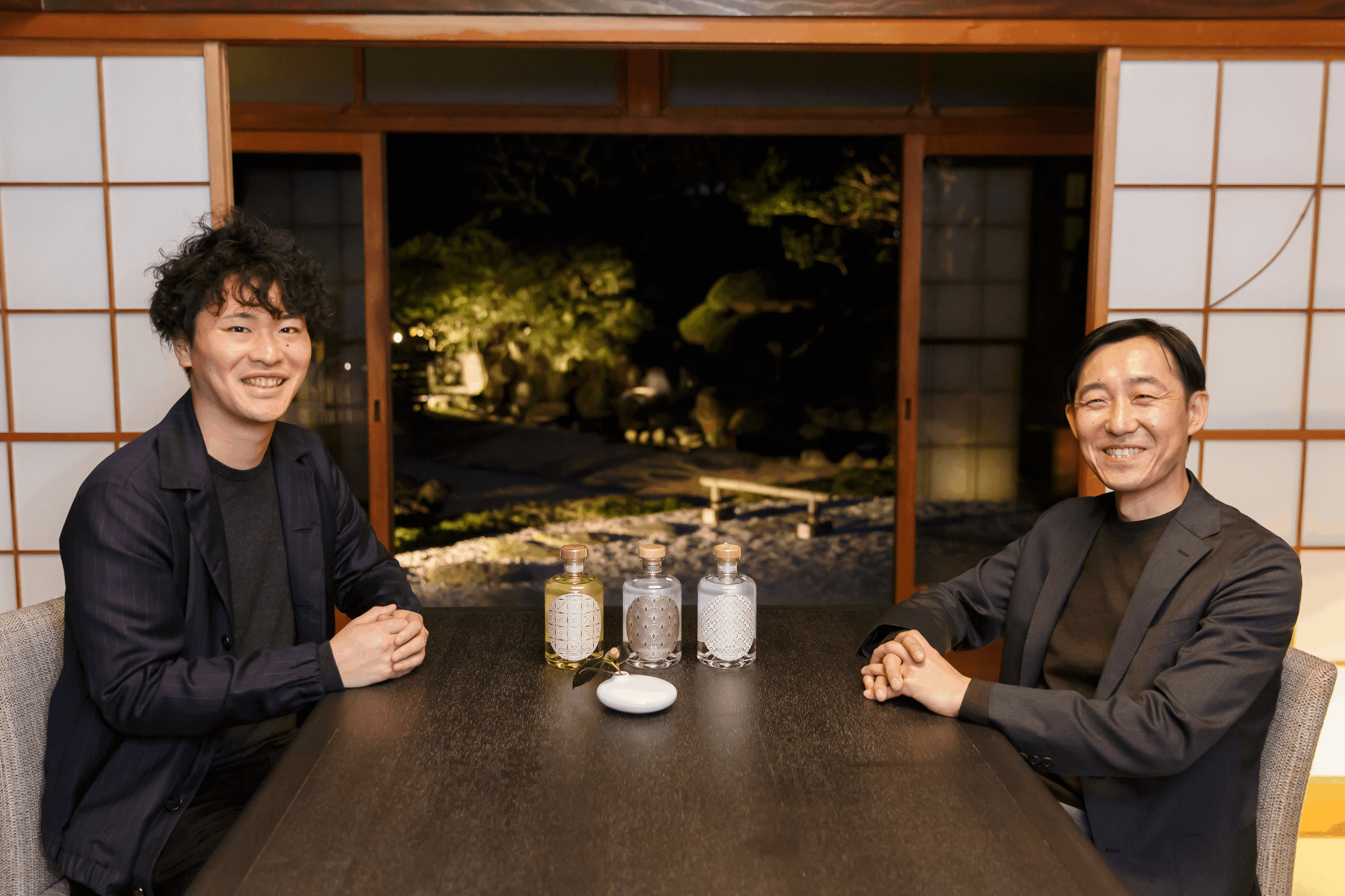
─ First, I would like to ask you about how you met, Mr. Sagae and Mr. Hashimoto.
Hashimoto (SHOCHU X): Exactly one year ago. Up until then, I had had a senior at university create the design for SHOCHUX, but when I started a new product (Kirausei), I wondered what it would be like if I had a different person create the design. That's why I was looking for a designer.
At that time, I was looking at the liquor bottles lined up at home, and my favorite craft gin, ``Kanomori,'' caught my eye.
``Kanomori'' is my favorite Japanese gin, not only because of its taste, but also because of its consistency in design. Come to think of it, I was wondering who designed this gin, so when I looked it up, Sagae-san's name came up right away. Looking at their track record, I see that they have done quite a bit of other alcoholic beverage designs, so I decided to inquire about this and got in touch with them.
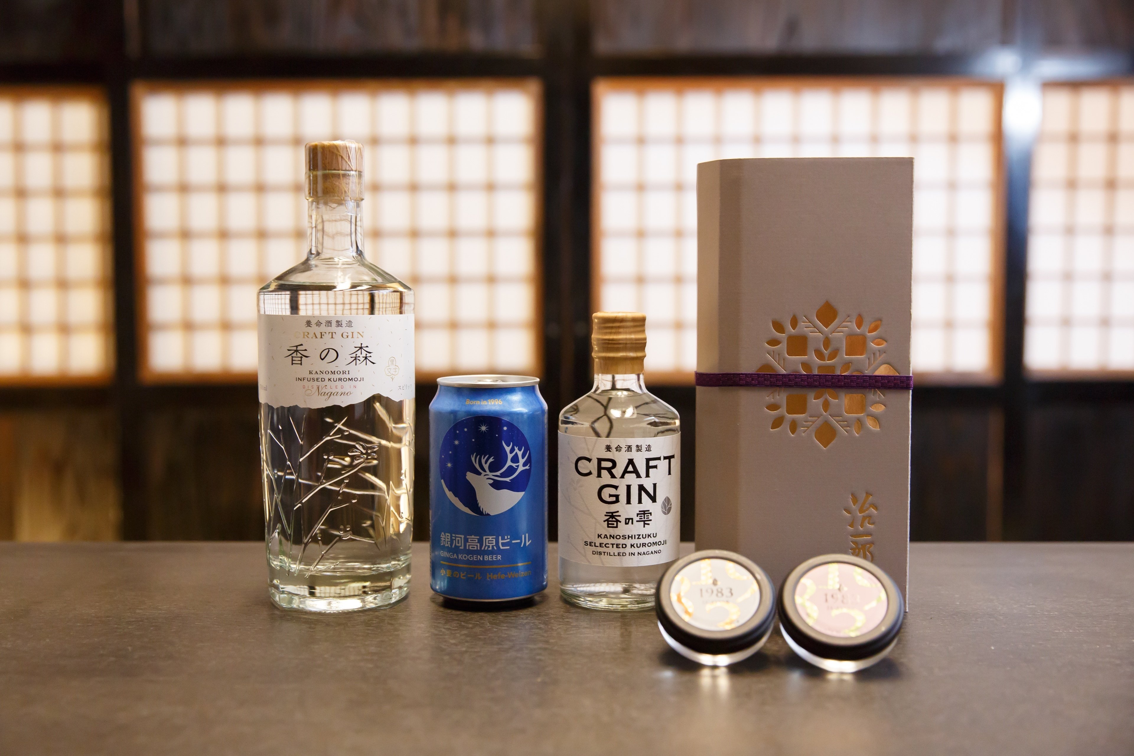 Some of Sagae's works. The far left is "Kanomori"
 ─ It seems like the bottle design led to this encounter...! Did you decide right away to work with Mr. Sagae?
Hashimoto: Yes. After contacting us, we decided to work together soon after we talked.
On the other hand, when I first started working on this project, I was thinking about various designs for the new product, but it just didn't feel right and I had a hard time deciding.
As we talked many times, Mr. Sagae asked me, ``Why don't you do some rebranding?'' I felt a deep sense of relief, or rather, a sense of relief. I remember responding, ``Let's do that.''
I think it was really good for me and the brand to hear you say that.
─ What were your first impressions of each other?
Sagae (SAGA INC.): In short, my impression is that he is a "passionate manager." I felt that Mr. Hashimoto's mission was simple and extremely well-honed. When I first heard the story, I thought I was going to be involved in this person's life. So I instinctively thought that this would be a great job.
Hashimoto: I still remember that when I first consulted Mr. Sagae, he was very kind to me. I often work with external partners, not just in design, but I personally don't like the idea of a relationship that is just a contract or contract. I would like to work with people who share my thoughts and share my passion.
In this respect, I thought Mr. Sagae was the person I would definitely like to work with.
Mr. Sagae's design beliefs
─ Mr. Sagae, is there anything you personally value most when designing?
Sagae: It's easy to put it into words, but difficult to realize, but we value ``designs that bring joy and happiness to life.'' In the work of creating a brand, we emphasize ``the value of relationships rather than the value of mere objects.''
It goes without saying that each design is as small as a human cell to society, but when they come together, they express the mood of society and the times, and ultimately the design and the people who live with it express the atmosphere of the society and the times. It can be said that there is a possibility that it can also affect the inner side of the person.
That's why I think carefully about the brand's social significance and how it should fit in with the target's self-actualization and lifestyle.
In the end, we have to involve the client together and discuss various issues before making a decision, but I believe that there are quite a few excellent qualities that are needed by people and society in the brands and products that exist in the world. It would be great if we could set a goal of branding and design to discover and embody, and as a result, provide designs that support ``people's happiness'' and designs that trigger ``changes in the mind to improve society.'' and.

─ Designs that help people's happiness and improve society are wonderful. Was there something that led you to have such a belief?
Sagae: There is a person named Dr. Martin Seligman who is the founder of positive psychology. He is famous for developing psychology from ``the science of eliminating emotional pain'' to ``the science of creating happiness,'' and he talked about design in a certain program. I was there.
"Up until now, technology, entertainment and design have been used for destructive purposes. Now we hope they will be used to eliminate suffering."
As sociologists have pointed out, the current coronavirus pandemic is a major turning point in human history, and we are in a time where we are faced with many challenges that we must overcome.
As a person like myself, there is only so much I can do, but after hearing Dr. Seligman's words, I started sharing my "good vision of the future" with clients and other people, finding what little I could do and implementing it as a brand activity. I would like to continue doing so.
Thoughts behind the rebranding of SHOCHU X
─ When designing SHOCHUX, did you start by envisioning a ``good future''?
Sagae: Mr. Hashimoto's passionate thoughts and actions regarding shochu boil down to "relationships with people," so there are parts that overlap with my way of thinking about design, and in that respect, it's easy to share the same direction with similar products. It was fast.
For example, when it comes to package label design, we can quickly overcome the hurdle of not imposing our own brand in an advertising way, and focus on the lifestyle and self-fulfillment of our customers, and deliver shochu to the world as a uniquely Japanese culture. As I progressed through the process, I was able to take time to focus on areas of concern while imagining how SHOCHUX could interact with people.
─ The resulting output was not just a change in package design, but a "rebranding" of the entire brand.
Sagae : From my point of view, I feel that the previous design was very conscious of ``looking high-class,'' and I think the design was different from the emotional value that SHOCHUX originally wanted to express. I was thinking.
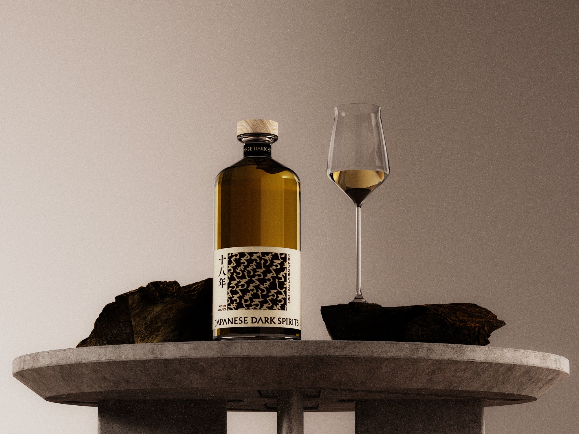
 Bottle design of "Kijina" before rebranding.
So, the first thing I talked to Mr. Hashimoto about was whether we would do the next product (Kirausei) to fit that context.
The more you expand along the same lines, the more difficult it becomes to go back. I thought that if the direction of the design was different from what Mr. Hashimoto had envisioned, it would be better to change it while the damage was still minor.
I was confident that there were many things I could do better, from conceptual aspects such as the impression of the brand and the value it provided, to operational aspects such as the ease of use of the logo, and I thought it would lead to good results in the future. , proposed a rebrand.
Hashimoto: I feel really glad that we rebranded now. My university senior, who was in charge of the previous design, also says that the current design is very good and is supporting me.
─With the rebranding, the impression of the brand has changed significantly from before. To be honest, weren't you scared to take the reins this far?
Hashimoto: I didn't feel scared at all. In fact, I had a strong awareness of design issues myself, so I felt strongly that something had to be done.
For example, I would like SHOCHUX to be placed in places where shochu has not traditionally been placed, such as bars, so that more people can enjoy shochu. We felt that the bottle design, which was similar to traditional shochu, was an inappropriate design for placing it in such a place.
Sagae: In line with the rebranding, SHOCHU
As bars themselves have changed from an era dominated by Western liquor culture to an international sensibility that includes Japanese alcohol culture and food culture, the rebranded SHOCHUX has contributed to the new bar style while also creating a rich, uniquely Japanese style. I'm looking forward to the future and hope that it will develop into the creation of culture.
─I would like to ask you about your thoughts on the rebranding.
Sagae: The order we received from Mr. Hashimoto was very simple: ``We want to create something that is typical of SHOCHUX.''
As we unraveled this, Mr. Hashimoto himself realized that shochu had the potential to compete on the world stage, and asked us to create a design that conveyed that message.
Therefore, we realized that we were required to create something hybrid that had a Japanese feel but could not remain the same as before, or something that had a Japanese feel but needed to be accepted overseas.
In expressing this, I would like to think about how to interpret shochu in a modern way and redefine it as ``how to enjoy happiness'' for a wider range of people. I did.
For example, in this day and age, it has become commonplace to buy products online, and the value required for product packaging has shifted from the traditional way of being easy to find in stores to what it should look like after being purchased online. I feel that I have done so.
In light of these changes, we try to refrain from making the logo large in order to make the brand recognizable, and instead create a design that blends into the room as if it were part of the interior, creating a time where everyone can enjoy and say, ``It's delicious.'' I placed great importance on whether or not it could become a reality.
In terms of brand recognition, there were some aspects that we decided to cut short, but I believe that as a result we were able to propose a style that fits in with the cultural efforts that will shape shochu in the future.
Intentions behind the three label designs
─With this rebranding, a wide range of designs were renewed, from the brand logo to the package design, but the new bottle design was particularly impressive. May I ask what your intentions were in the design?
Sagae: Now, I would like to talk about three label designs.
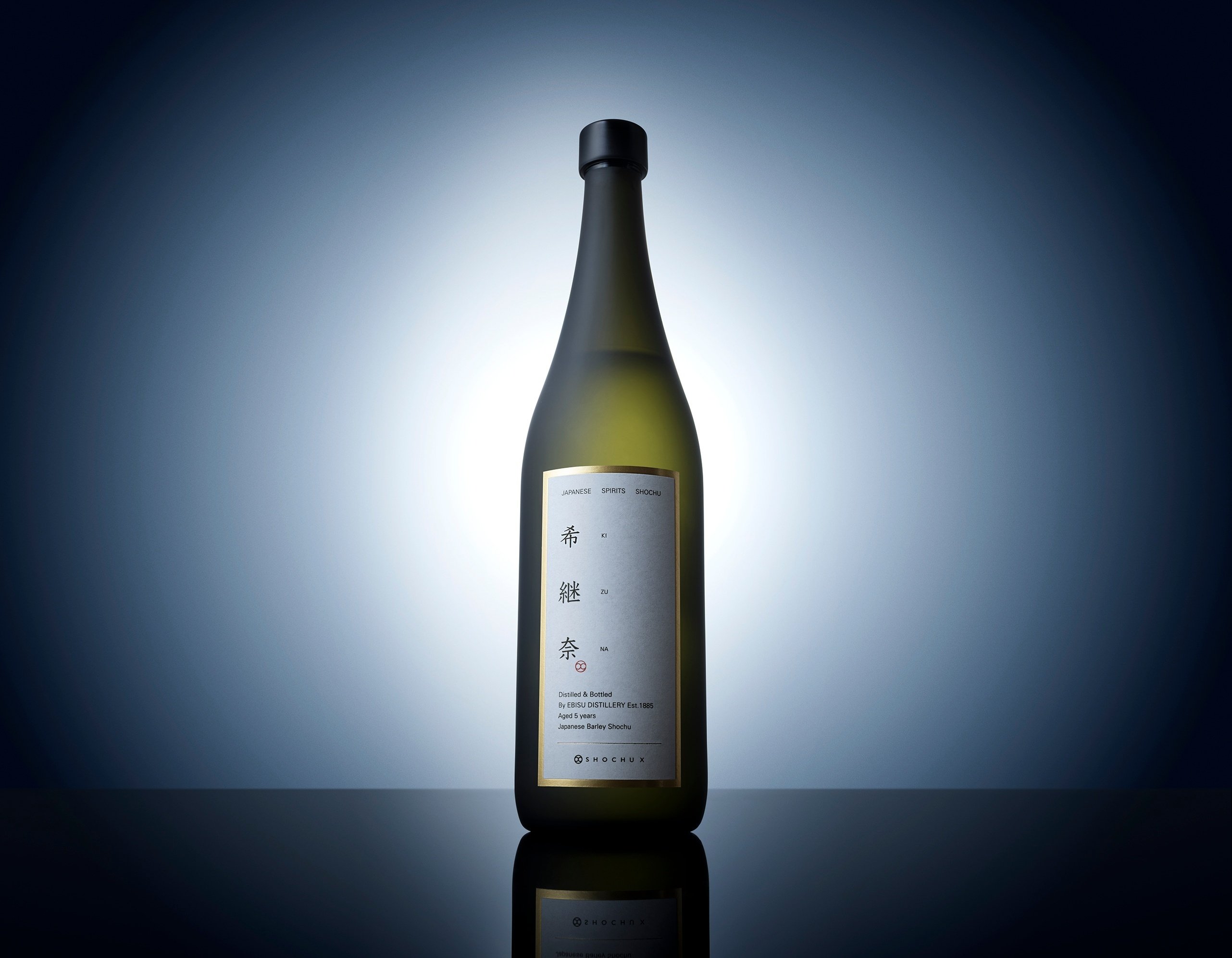
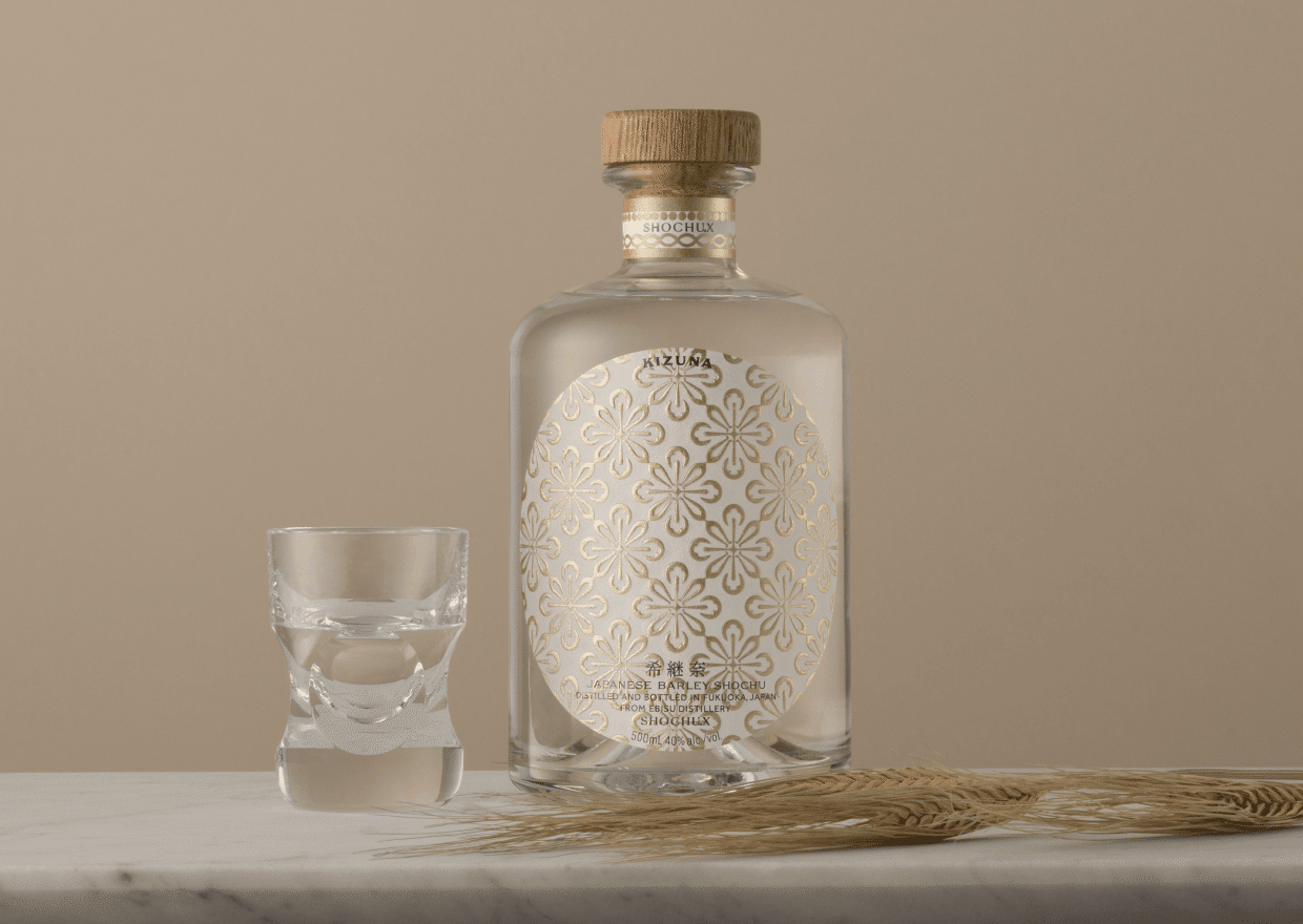
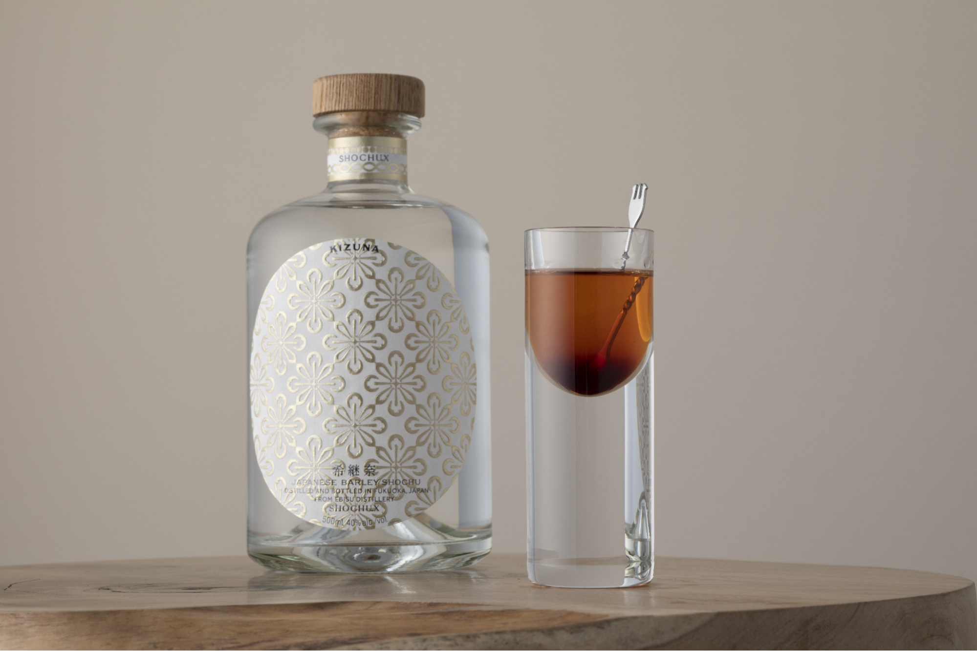
●Kijina
The starting point was that I was given this job during the coronavirus pandemic, which made me think once again about the connections between people and how we can relate to each other. As the name of the product comes from, we created it with the idea in mind that even though we can't meet each other, we can still feel like we're drinking together.
Also, I think flowers are often given as gifts, and I wanted to incorporate the underlying feeling of giving flowers.
The design is such that the flowers are barely attached to each other, giving the impression that people are connected, and I hope that Kijina can play that role. I put it in.
The original SHOCHUX logo also has the concept of glasses connecting people, and in rhyme with this concept, the petals are made to look like individual glasses.
And there is also an image that the X of SHOCHUX is crossed. This form was created by taking into consideration each of these elements.
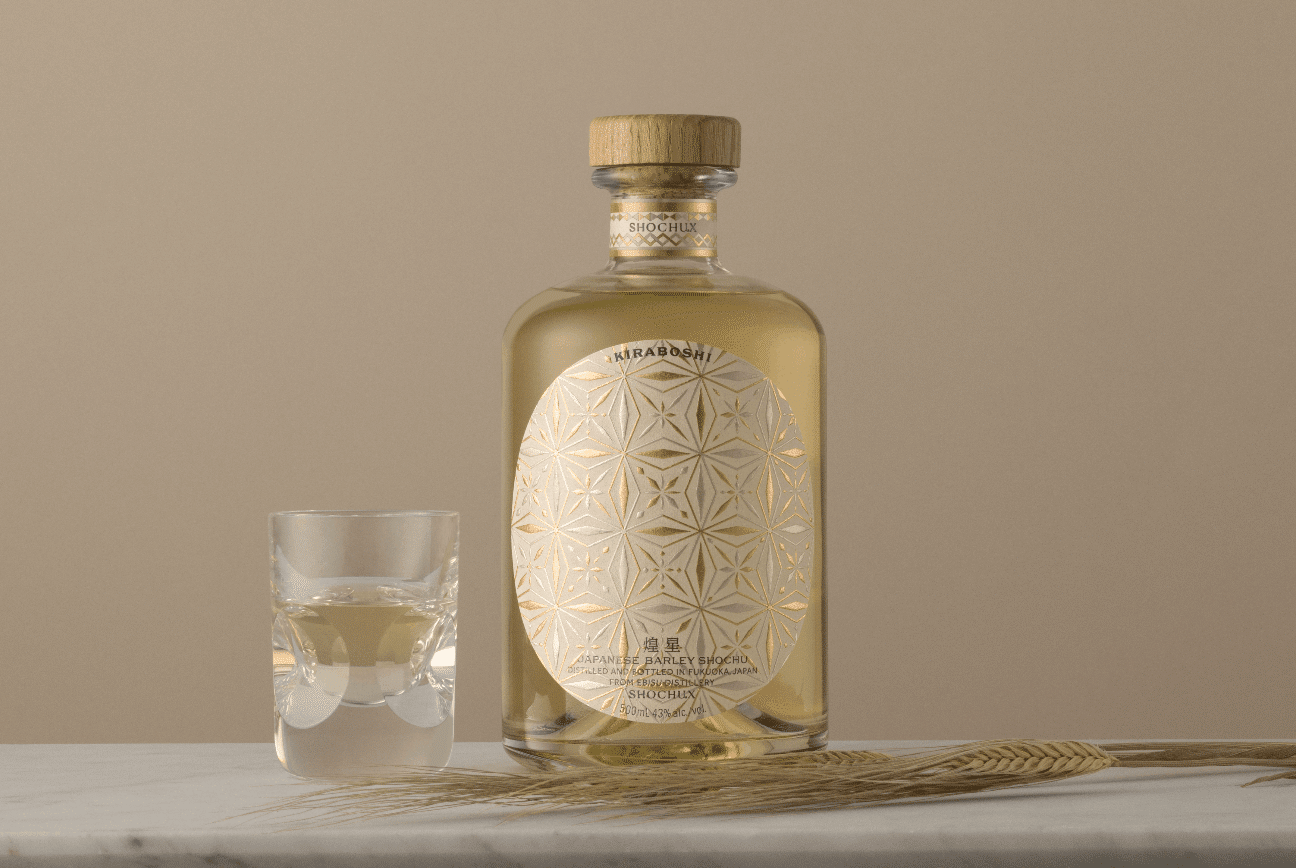
- Sparkling Star Sparkling Star originally refers to the stars floating in the universe, but I thought I would replace it with each person.
In Buddhism, there is a saying, ``cherry blossoms, plums, peach li'' (*), and inspired by this word, the stars are not the same twinkling stars, but if you look closely, they are stars with slightly different shapes. . Unlike the one-color pattern of "Kijina" to reinforce the sparkle of the stars, this is a craft product that uses extremely difficult two-color foil stamping and embossing with "the divine skill of an engineer" with almost no deviation. A label like .
*Oubai Tori: Cherry blossoms, plums, peaches, and plums. It contains the lesson of developing your individuality without comparing yourself to others, so that each person can bloom into their own beautiful flower.
The message is that we want those who drink this to shine in a variety of ways that are unique to them, and that this is an alcoholic beverage that will help them achieve that radiance.
It's great for drinking while thinking in agony or talking about your dreams, so I hope it becomes a drink that can be used in such situations.
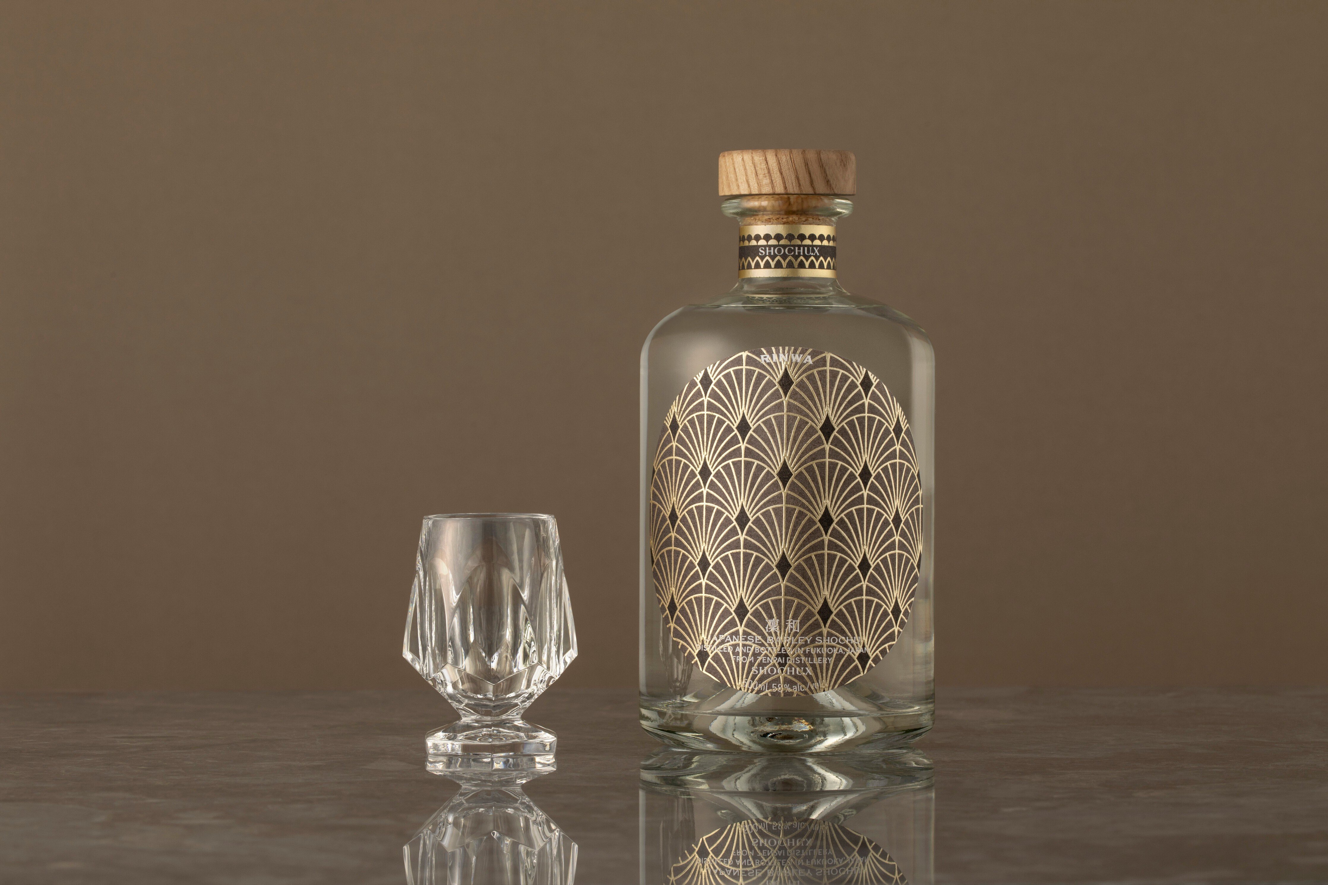
●Rinwa
We used a dark background, which is different from the previous two labels, with the aim of clearly expressing the 58% alcohol content that sets this product apart from other products, as well as the special feeling of bottling a rare whiskey. .
From the name ``Rinwa,'' I interpreted it to mean a dignified single flower and the expanding circle it creates, and I imagined a drama in my head where one person's will changes the whole thing.
As you can see from the label, if you cut out part of the pattern, it will be in the shape of a single flower.
There is a diamond-shaped sparkle in the center, and I wanted to express the aroma that spreads out when you actually drink Rinwa, as well as the impression of ``a cup heading towards the heavens'', based on the name of the brewer Tenka Sake Brewery. did.
I can clearly see that Mr. Hashimoto has a tremendous amount of respect for the makers and love for shochu, and awe for the sake brewers who have overcome various eras and have a history. , I wanted to capture that feeling, so I created this design.
Hashimoto: I feel that you have successfully expressed the core of the brand, including the shochu manufacturing process, the brand concept of promoting the diversity of shochu, and the respect you have for the sake brewers.
Looking beyond rebranding to the future of shochu
─ Through the rebranding, I felt that the SHOCHUX brand and design were in sync.
Hashimoto: I have communicated with Mr. Sagae many times not only about SHOCHUX products, but also about the current state of shochu, and I believe that he has incorporated the big picture that SHOCHUX is aiming for into the design.
Sagae: At our first meeting, Mr. Hashimoto really conveyed his awareness of the issues facing the shochu industry. If you dig deeper into this, you will find that they are very social and altruistic, and everything they say is not selfish.
Mr. Hashimoto's driving force lies in this, so I felt reassured that whatever he did, he was moving toward a "good future with shochu." Therefore, I wanted to pursue a design that would be more beneficial to the customer, rather than "commercially" or "to make a profit."
Mr. Hashimoto decided to rebrand not just because he wanted to deliver products, but also because of the traditional culture surrounding shochu, the possibilities for the future, and the existence of people, including sake breweries, who pour their heart and soul into it. I think this is because we respect the industry, want to make it easier for many people to find it, and want to play the role of a lighthouse for the industry as a whole.
Hashimoto: It would be presumptuous of me to say that the industry as a whole...! But I tend to say that (lol).That's the driving force behind starting the company, so I always want to be aware of the issues facing the industry.
Shochu is a so-called traditional industry. I work side by side with people who are making products that will last hundreds of years and who have made sake breweries their lifelong vocation, so I don't think I can give up easily.
Innovating the industry is by no means an easy challenge, but I believe that we must continue no matter what.
The experience we want to deliver to our users
─ Please tell us about the value and experience you want to deliver to users through the rebranded design.
Hashimoto: I would be happy if people who had never been familiar with shochu until now saw SHOCHU
After rebranding, we are very grateful that we have received many compliments on the design from customers and have been spreading the word on social media. I once again feel the importance of design.
Mr. Sagae said something similar earlier, but when you think about how good design can make people reach out for things they weren't interested in before, he believes that design has the power to change a person's life. I am thinking.
Design will be the gateway to shochu, people will become interested in shochu, they will love shochu, and maybe some people will work in the shochu industry like me. I believe that we have created a design that has so much potential.
Sagae: I personally don't think that traditional shochu designs are bad at all. I think it's a good design that lets you feel the soul of the creator.
On the other hand, it would be a shame if the possibilities were limited due to something that cannot be felt from the design alone, or because of the changing times, there is a fixed concept that ``shochu design should be like this.'' I think.
I feel like Mr. Hashimoto is someone who can help people break through and recognize the potential that people have. I think this is true for both yourself and the people around you.
I hope that people will experience the value of coming into contact with these brands through SHOCHUX's design and shochu.
In the future, Japan's population will continue to decline, and we will be living in an era where people are becoming more and more of a resource.
I would like young people who will lead the future to come into contact with this.
I want you to drink your dreams with me.
[Editor's note]
It was very impressive to see the two of them happily talking about the future of shochu and what they want it to be as a brand.
When we secretly asked Mr. Sagae about his future design plans, we learned that in order to make the image of shochu more familiar and appealing to culture, we would like to create a landscape with shochu that includes not only the alcohol itself but also pairings and sake vessels. It seems that they are planning to disseminate ".
For example, they aim to update shochu so that it can be easily accessed in everyday life, just like how you brew and drink coffee every day or easily enjoy afternoon tea.
Please pay attention to the further evolution of SHOCHU X in the future.
%20Crea...)